Welcome to TalkGraphics.com
Results 1 to 5 of 5
  1. #1
    Join Date
    Aug 2012
    Location
    Sydney Hills District, Australia.
    Posts
    133

    Default Page Width Peculiarities on Mobile Devices (Mobile Variant or not!)

    Hi!

    I wonder if anyone can shed some light on a few issues I'm having with page widths?

    Ok, so I get that a page has a width, but some screens may be wider than my page. I like webpages that stretch an image or a bar of colour right across the page so there's no white margins on either side.

    I do this on my website (www.biready.com.au)

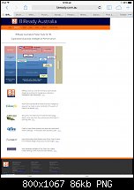
    However, I find that when viewed on a tablet or mobile phone, the browser there allows sideways scrolling to see the end of said colour bars. It appears the mobile variant totally disregards the page width and permits me to scroll into white space.

    See the attached images to see what I mean. The iPad screenshot is using the same variant as my desktop browser which also has this problem.

    How can I eliminate this problem?! How can I get my pages to not scroll beyond their page widths?


    Click image for larger version. 

Name:	photo.PNG 
Views:	172 
Size:	158.2 KB 
ID:	102214 Click image for larger version. 

Name:	photo2.jpg 
Views:	179 
Size:	86.5 KB 
ID:	102215

  2. #2
    Join Date
    Aug 2000
    Location
    Harwich, Essex, England
    Posts
    21,917

    Default Re: Page Width Peculiarities on Mobile Devices (Mobile Variant or not!)

    Looking at your mobile site via firebug it would appear that you haven't reduced you headers as inspecting the element gives:
    <span class="xr_ar xr_t110" style="left: -824px; top: 0px; width: 2528px; height: 116px; backgr….000,0,0); transform: matrix(1.000,-0.000,0.000,-1.000,0,0);">
    2528 pixel width is a tad to wide for a mobile You need to reduce these in your mobile variant.

    New to this bit myself of course but I think it's worth a look at.
    Egg

    Intel i7 - 4790K Quad Core + 16 GB Ram + NVIDIA Geforce GTX 1660 Graphics Card + MSI Optix Mag321 Curv monitor
    + Samsung 970 EVO Plus 500GB SSD + 232 GB SSD + 250 GB SSD portable drive + ISP = BT + Web Hosting = TSO Host

  3. #3
    Join Date
    May 2014
    Location
    Lebanon
    Posts
    4

    Default Re: Page Width Peculiarities on Mobile Devices (Mobile Variant or not!)

    Hello Ian, I'm here to seek assistance on how can I create the expanding social medial icons shown on the left side of your page (www.biready.com.au) Thx.

  4. #4
    Join Date
    Aug 2000
    Location
    Placitas, New Mexico, USA
    Posts
    41,503

    Default Re: Page Width Peculiarities on Mobile Devices (Mobile Variant or not!)


  5. #5
    Join Date
    Oct 2010
    Location
    South Africa
    Posts
    877

    Default Re: Page Width Peculiarities on Mobile Devices (Mobile Variant or not!)

    Quote Originally Posted by gwpriester View Post

    Thanks Gary - been looking for something like this - much easier than the individual Xara widgets....


Tags for this Thread

Bookmarks

Posting Permissions

  • You may not post new threads
  • You may not post replies
  • You may not post attachments
  • You may not edit your posts
  •