Welcome to TalkGraphics.com
Page 1 of 14 12311 ... LastLast
Results 1 to 10 of 138
  1. #1
    Join Date
    Apr 2007
    Location
    USA
    Posts
    280

    Default Interweaving vines with 3D text

    Thought about suggesting that also........you beat me to it by a lot.

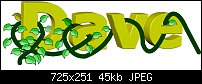
    Now back to the original topic. While I am not editing an image in the same sense that you did. I had an idea for something I used to do by hand (usually when I was flying to pass the time). I have just started here but I think you will see where I am headed. I created some text, and then drew a line that I wanted to pass through the text at different points. What I really want is a vine that weaves through the letters. I then created a leaf to apply along the vine. I used the clone tool like you did to make the line disappear behind the letters at different points using the same process we used in creating the mask in your tutorial.

    Now I have a couple of things, one in particular, that I am struggling with. I want the vine to diminish in size as it moves from right to left. I will eventually create multiple leaves of different sizes and some color variations. I think I will also need to try to put some portions on different layers so I can intermix things a little better. I think you will all be able to see what I am trying to accomplish and Gary's tutorial inspired my to try this approach. Any suggestions of how to get to the next step will be greatly appreciated.

    Again, I see this as just a starting point and that I could use your suggestions/help.

    Click image for larger version. 

Name:	DaveVine.jpg 
Views:	444 
Size:	45.3 KB 
ID:	94698

  2. #2
    Join Date
    Dec 2007
    Location
    Sunshine Coast BC, Canada. In a beautiful part of BC's temperate rainforest
    Posts
    9,864

    Default Re: February 2013 Video Tutorial - Advanced Image Retouching

    Hi Dave, I would tackle this as a graphics related project rather than a photo editing one. And as such it might be better to discuss this in the Xara Graphics Forum instead. It is easier to remove the unwanted parts of the vine with either the eraser tool or by subtracting shapes. If you would like to start a new thread in the Xara graphics forum or if Gary could split off your post and my reply into a new thread there (I don't have pemissions here in the Xara Xone forum) I'll be happy to show you a technique for doing this
    [SIGPIC][/SIGPIC]
    My current Xara software: Designer Pro 365 12.6

    Good Morning Sunshine.ca | Good Morning Sunshine Online(a weekly humorous publication created with XDP and exported as a web document) | Angelize Online resource shop | My Video Tutorials | My DropBox |
    Autocorrect: It can be your worst enema.

  3. #3
    Join Date
    Apr 2007
    Location
    USA
    Posts
    280

    Default Re: February 2013 Video Tutorial - Advanced Image Retouching

    Frances, you or Gary may move this to another forum if you like. I through together a quick little "tutorial" that kind of explains what I was doing and why I though it was appropriate here. I do not think using the eraser tool or subtracting will achieve the same results but I am sure open to another approach. Since I trying to take the vine and weave it through the text (some portions if front and some in back - well OK, the eraser might work if done carefully). Since I created to bitmap copies, this winds up to be the same process of using multiple copies of an image to (one used to modify another).

    This one is not as precise or as complete as the one I posted before because I just wanted to explain my processes.

    Click image for larger version. 

Name:	DaveVineTutorial.jpg 
Views:	365 
Size:	94.6 KB 
ID:	94707

    I sill would like to have a better method of creating the vine so it tapers between the start and end.

    Again, if it is more appropriate somewhere else, no problem. I am wide open to anyone who has suggestions as to the best method of achieving my final goal of weaving a vine through text. This seemed like a small chore when I did it manually with a pencil but has turned into a challenge doing it electronically

  4. #4
    Join Date
    Oct 2002
    Location
    Liverpool, N.Y.
    Posts
    6,085

    Default Re: February 2013 Video Tutorial - Advanced Image Retouching

    As you can see, Dave (and all) I promoted this discussion out of the Image Retouching thread. It didn't help the flow of this month's video discussion and at the same time, the technique is too interesting and the concept too intriguing to get buried in the monthly tutes.

    you can use the clone tool to make the vine appear to go in front of and in back of the lettering; you can also use the Eraser tool if you're working with XDP, and you can also clipview the vines, as I've done in the attached file.

    Dave, to answer your question about dimensionalizing the vine, use a pressure profile (on the Line Gallery). The other thing you can do to make it look more dimensional is to shade it. I blended a 2px wide line with a 16 px one behind it, using different shades of olive.

    You don't need to work between different layers, Dave, unless you want to. You create a leaf and then press Ctrl+Shift+B a number of times to send a copy to the back of the stack of shapes on the current layer.

    Feel free to check out and improve upon my begging of the attached file.

    Oh, and begin with an inspired font! Ariel doesn't cut it artistically. I used "Floral Caps" Use the lowercase characters if you want to extrude the letters-uppercase are far too ornamental and complex! <click here>.

    Click image for larger version. 

Name:	Dave's-vineyard.jpg 
Views:	2244 
Size:	19.2 KB 
ID:	94711

    My Best,

    gary
    Attached Files Attached Files

  5. #5
    Join Date
    Apr 2007
    Location
    USA
    Posts
    280

    Default Re: February 2013 Video Tutorial - Advanced Image Retouching

    OK - Now that is what I am talking about.........I go to check out that pressure profile.

    I had put my leaves at different levels the same way you did. They were all drawn on the top layer then I just moved them backward when I wanted them to be behind something else.

    Yep, that is a neat font. I just used the arial before because I was just trying to launch the idea.

    As for the vine, I had the glowing tube in your book in the back of my mind but did not take the time to go that route yet because I was somewhat fixated on the "shrinking" part. I need to go off and play with the pressure profile for a little while and understand how to apply it.

    Might take me a day or tool (some other commitments) but I am going to try again. I am not 100% happy about the way the 3D tool angles the letters moving from the left to right. I might consider doing each letter independently with the same settings but I will have to play with that as well.

    I will also mess around with the eraser tool a little as well and see how I like that method as compared to the clone method.

  6. #6
    Join Date
    Oct 2002
    Location
    Liverpool, N.Y.
    Posts
    6,085

    Default Re: February 2013 Video Tutorial - Advanced Image Retouching

    Dave—

    What I did with my text was convert it to editable shapes, ungroup the shapes, and then with all four selected, I applied the Extrude tool effect. And with all four still selected, I "group changed" the rotation and the lighting.

    You can do that.


    -g

  7. #7
    Join Date
    Apr 2007
    Location
    USA
    Posts
    280

    Default Re: February 2013 Video Tutorial - Advanced Image Retouching

    Yes, I thought of that after I posted the reply. I am having a little problem getting the blend to work like you did. I am sure doing something wrong but will keep playing until I understand it.

    BTW: The profiles I see in the line gallery produce some long tails and apply them to both ends. Are there some other lines profiles I should download? And, I downloaded the font. I really like it.

  8. #8
    Join Date
    Dec 2007
    Location
    Sunshine Coast BC, Canada. In a beautiful part of BC's temperate rainforest
    Posts
    9,864

    Default Re: February 2013 Video Tutorial - Advanced Image Retouching

    Hi Dave and Gary I haven't been ignoring this discussion I've just been busy today. I use what I call the sandwich method to do this. I put together a rough mini tutorial to show you how I use the eraser tool (this could also be done by intersect or even an opacity mask)

    This is quite roughly done and the vine needs shading but I think you should get the idea of how I sandwich the letters in between two copies of the vine and erase away the parts I don't need. I use a graphics tablet and set the eraser to use the pressure sensitivity.
    Attached Thumbnails Attached Thumbnails Click image for larger version. 

Name:	vinetwined.jpg 
Views:	368 
Size:	120.1 KB 
ID:	94714  
    Attached Files Attached Files
    [SIGPIC][/SIGPIC]
    My current Xara software: Designer Pro 365 12.6

    Good Morning Sunshine.ca | Good Morning Sunshine Online(a weekly humorous publication created with XDP and exported as a web document) | Angelize Online resource shop | My Video Tutorials | My DropBox |
    Autocorrect: It can be your worst enema.

  9. #9
    Join Date
    Apr 2007
    Location
    USA
    Posts
    280

    Default Re: February 2013 Video Tutorial - Advanced Image Retouching

    Thanks Frances - Do you really need the underneath vine?

    I was thinking about putting the leaves there independently but then I guess our method allows me to visualize the entire vine all at once.

  10. #10
    Join Date
    Oct 2002
    Location
    Liverpool, N.Y.
    Posts
    6,085

    Default Re: February 2013 Video Tutorial - Advanced Image Retouching

    Argh! Frances, please uninstall Ariel from your system! :)
    Go to Font Squirrel and get Nick Curtis’ “Wooden Nickel” (a homage to Bernard Condensed it looks like). I feel if we’re in this to educate, we use artistic fonts, eh? :)

    Click image for larger version. 

Name:	wooden-nickel.jpg 
Views:	307 
Size:	13.7 KB 
ID:	94715

    Dave, to make a blend between two open paths as I did, you first create a wide path, such as 16 pixels in width. Zoom way in and then Ctrl+K the original. Then apply a 2 pixel width to the copy and give it a color that contrasts with the original…so you can see it, a secondary reason. Then with the Blend tool and both paths selected, you drag from the broad one to the slender one. It takes patience. But once you have the blend, you can increase the blend steps and set profile distribution using the Infobar options.

    Also, when you want to choose one or the other control object in the blend, with the Selector tool, Ctrl+click the broader path. If you want the slender one but it’s hard to manually select, you press Tab to cycle to the other control path.

    And I am actively soliciting tips and tricks for just about any month of the Xara Xone. so if ya got longer stuff than these invaluable nuggets, or even ones you haven't posted yet, talk to me.

    -g


Bookmarks

Posting Permissions

  • You may not post new threads
  • You may not post replies
  • You may not post attachments
  • You may not edit your posts
  •