Originally Posted by Rik


 Member
If someone tried to make me dig my own grave I would say No.
They're going to kill me anyway and I'd love to die the way I lived:
Avoiding Manual Labour.
 Super Moderator
OK, Beret.
So, you're saying that,
this:looks like this:
OK! I'll take your word for it.
I chose a font (Avenir 85 Heavy) which I thought looked good and classy and then angled things.
Which, I thought was a good idea because you get a bit of an optical illusion as well.
Both parts are exactly the same size but the one at the back looks smaller.
Oh well. I tried.
The OP appears to have gone AWOL.
Featured Artist on Xara Xone . May 2011
. A Shield . My First Tutorial
. Bottle Cap . My Second Tutorial on Xara Xone
 Member
Wow! That's a lot of good input. Thank you every one for taking an interest in this layout. This is a personal logo, so 95% of the logo use will be electronic, but it is a good idea to have a printable logo available.
I also ran into the problem of my logo looking like Photo Shop and Play Station. Rik, i like your idea of your design with the extrusion but it is similar to the Play Station design. I really like the way that you morphed the litters in your logo. It's very well done. I am trying to accomplish the same thing with my initials PS.
I have put a few together with and without extrusions and one without any gradients. (the middle one) It also works in grayscale. The one I like so far is the one that I'm using for my avatar.
Thank you Gary for your input, I tried to do a gold layout as you suggested but something dose't look quite right. it needs work. I posted some others that i used gold in that I would like to get your opinion on. This is still a work in progress.
Thank you frank for your input, I have reduced my work to 75 pix and they look good. I haven't printed any yet, but i will when i get closer to the final design.
Thank you all again for your help,
Paul
Last edited by Psaumure; 26 September 2012 at 07:00 AM.
Super Moderator
Here's what developed by playing with the Ethnocentric font.
Featured Artist on Xara Xone . May 2011
. A Shield . My First Tutorial
. Bottle Cap . My Second Tutorial on Xara Xone
Super Moderator
And one more.
Featured Artist on Xara Xone . May 2011
. A Shield . My First Tutorial
. Bottle Cap . My Second Tutorial on Xara Xone
Member
Very nice Rik, That's more what I'm looking for, Very well done. i"m not sure what one I like best. You are giving me a lot of great ideas. I like your work.
Thank you very much for your help,
Paul
Super Moderator
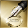
Try your 3D magic with my last logo, and see what you can come up with?!
Featured Artist on Xara Xone . May 2011
. A Shield . My First Tutorial
. Bottle Cap . My Second Tutorial on Xara Xone
Member
Very nicely done Rik, Yes in deed, I will give that one a try. Thank you.
Here it is, I think i like this one. What do you think? I am playing around with the design.
Last edited by Psaumure; 27 September 2012 at 11:57 AM.
 Member
LOVE IT! I missed something along the way. What does the squiglly rep. in the second example?
ron
R_o_n _a_l _d __C. __D_u_k_e
x a r a . c o m..a r t i s t s ..g a l l e r y
Xara's Facebook
Xara Designer Pro X 16, Xara 3D7 Web Designer
Member
Thank you Ron, It means that it dos't work. My instals are, "PRS" but I can use just, "PS". I was trying both just to see. Apparently, the R dos not stand out.
 Posting Permissions

 Reply With Quote

Bookmarks