I'm playing around with my initials trying to make an interesting logo. I can do PS or PRS. I'm looking for a more simple logo like Rik's RD. This one looks good but would be a bit buzzy for stationary. Any thoughts?
Paul

 Member
I'm playing around with my initials trying to make an interesting logo. I can do PS or PRS. I'm looking for a more simple logo like Rik's RD. This one looks good but would be a bit buzzy for stationary. Any thoughts?
Paul
Last edited by Psaumure; 24 September 2012 at 04:53 AM.
Member
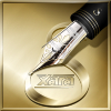
Maybe I should go with something with a metal finish?
Last edited by Psaumure; 24 September 2012 at 06:20 AM.
 Member
When redesigning a logotype, always think:
1) will it look OK photocopied (i.e. monochrome, reduced resolution)
2) will it look OK reduced
That's why I wouldn't recommend anything that is heavy with gradients. Yours above are all nice in one way or another, but they all rely on higher resolution colour display.
If someone tried to make me dig my own grave I would say No.
They're going to kill me anyway and I'd love to die the way I lived:
Avoiding Manual Labour.
Member
Thank You Frank. I had already put another one together before reading your post. What type of layout would you recommend? Currently, I'm working on the letter layout. I think one of these would make a good avatar though. I'm sure Rik will have a few good suggestions also.
I like this last one very much, I'm sure I can use it for something. It's done just with the extrude tool aside from a few transparencies and a gradient background.
Thanks again for the tips,
Paul
 Super Moderator
If you're doing a logo, then how about something nice and simple?!
Featured Artist on Xara Xone . May 2011
. A Shield . My First Tutorial
. Bottle Cap . My Second Tutorial on Xara Xone
Super Moderator
Not sure about this one, but it might give you an idea or two!
But, of course, I will have another think.
As a logo, I like my first attempt, at the moment.
Featured Artist on Xara Xone . May 2011
. A Shield . My First Tutorial
. Bottle Cap . My Second Tutorial on Xara Xone
Super Moderator
I like this one.
You like your 3D!
One more.
Featured Artist on Xara Xone . May 2011
. A Shield . My First Tutorial
. Bottle Cap . My Second Tutorial on Xara Xone
 Moderator Emeritus
Your blue 3D logo is the most unique of any of these and works the best for me. None of the others really indicate the work you are capable of doing.
The cube with the 3D letters is a cool effect but a very unimaginative logo. Can you do a chrome or gold version of the green logo?
To Frank's point, can you simplify the logo to create a version without gradients. Possibly just a bold outline or even a thick and thin outline.
While I also like the treatment inside the sphere, IMHO it is unnecessary. Simple is always better.
Gary W. Priester
Mr. Moderator Emeritus Dude, Sir
gwpriester.com | eyetricks-3d-stereograms.com | eyeTricks on Facebook | eyeTricks on YouTube | eyeTricks on Instagram
Member
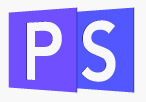
Looks far too close to the photoshop icon...Originally Posted by Rik

If someone tried to make me dig my own grave I would say No.
They're going to kill me anyway and I'd love to die the way I lived:
Avoiding Manual Labour.
Super Moderator
I've done a search for PhotoShop icons and cannot find anything that looks like that?
But, I'll take your word for it.
My initial idea (in my head) was to have the 'S' more behind the 'P' but then the 'S' lost all its appeal.
I think many things can look very similar though.
Mind you. The OP seems to be very conspicuous by his absence!
Featured Artist on Xara Xone . May 2011
. A Shield . My First Tutorial
. Bottle Cap . My Second Tutorial on Xara Xone
 Posting Permissions

 Reply With Quote

Bookmarks