Welcome to TalkGraphics.com
Page 1 of 2 12 LastLast
Results 1 to 10 of 12
  1. #1
    Join Date
    Jan 2004
    Location
    Limburg,Netherlands
    Posts
    454

    Default John Logan Logo wip

    Thx Rik for the inspiration.

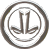
    Here's what I have so far, there are 2 letters hidden in the logo that only people that know me personally will see, it's partly why I used the (arrow) shape I used.
    Also Some of them can be viewed upside down or on its side and you'll still read JL in the logo.

    J.L.
    Attached Thumbnails Attached Thumbnails Click image for larger version. 

Name:	JL logo2.jpg 
Views:	168 
Size:	18.6 KB 
ID:	91456   Click image for larger version. 

Name:	JL logo.jpg 
Views:	161 
Size:	53.7 KB 
ID:	91455  

    Last edited by JohnLogan1973; 10 August 2012 at 05:10 PM. Reason: added 2e logo

  2. #2
    Join Date
    Jun 2009
    Location
    Reading. UK
    Posts
    6,985

    Default Re: John Logan Logo wip

    Of course I know what the letters are?!

    In the second picture, I like the black & white one best. It's very classy.
    Last edited by Rik; 10 August 2012 at 05:53 PM. Reason: slight alteration to comment

    Featured Artist on Xara Xone . May 2011
    . A Shield . My First Tutorial
    . Bottle Cap . My Second Tutorial on Xara Xone

  3. #3
    Join Date
    Jan 2004
    Location
    Limburg,Netherlands
    Posts
    454

    Default Re: John Logan Logo wip

    Here's the one I think i'll be using, and Rik It's not the J or the L, it's PC(one of my nicknames) and you only see them in part and only when the arrow is pointing down
    Attached Thumbnails Attached Thumbnails Click image for larger version. 

Name:	JL logo3.jpg 
Views:	142 
Size:	5.1 KB 
ID:	91457  
    Last edited by JohnLogan1973; 10 August 2012 at 06:26 PM.

  4. #4
    Join Date
    Jan 2004
    Location
    Limburg,Netherlands
    Posts
    454

    Default Re: John Logan Logo wip

    Quote Originally Posted by Rik View Post
    In the second picture, I like the black & white one best. It's very classy.
    I also liked that one, but it looked alittle like I had seen it before, think u'll see it now too.
    Attached Thumbnails Attached Thumbnails Click image for larger version. 

Name:	JL logo4.jpg 
Views:	137 
Size:	7.5 KB 
ID:	91458  

  5. #5
    Join Date
    Aug 2000
    Location
    Placitas, New Mexico, USA
    Posts
    41,503

    Default Re: John Logan Logo wip

    I like this direction, but can you make it more elegant, so it represents your illustration style?

  6. #6
    Join Date
    Jan 2004
    Location
    Limburg,Netherlands
    Posts
    454

    Default Re: John Logan Logo wip

    gwpriester

    I like this direction, but can you make it more elegant, so it represents your illustration style?

    Okay I think this one is more elegant and represents my illustration style + in the second image it shows why I did what I did in the logo.(not keeping the eyes).
    Attached Thumbnails Attached Thumbnails Click image for larger version. 

Name:	JL logo4.jpg 
Views:	148 
Size:	16.4 KB 
ID:	91472   Click image for larger version. 

Name:	JL logo5.jpg 
Views:	143 
Size:	8.1 KB 
ID:	91473  

    Last edited by JohnLogan1973; 11 August 2012 at 01:25 PM.

  7. #7
    Join Date
    Jan 2004
    Location
    Limburg,Netherlands
    Posts
    454

    Default Re: John Logan Logo wip

    Here's how it looks now.
    Almost looks like it's smiling.
    Attached Thumbnails Attached Thumbnails Click image for larger version. 

Name:	JL logo5.jpg 
Views:	140 
Size:	7.5 KB 
ID:	91475  
    Attached Images Attached Images  
    Last edited by JohnLogan1973; 11 August 2012 at 04:28 PM. Reason: Added still Logo

  8. #8
    Join Date
    Aug 2000
    Location
    Placitas, New Mexico, USA
    Posts
    41,503

    Default Re: John Logan Logo wip

    This is nice. I like it.

  9. #9
    Join Date
    Apr 2005
    Location
    Vancouver Island, British Columbia
    Posts
    4,194

    Default Re: John Logan Logo wip

    Very creative logos, John.

  10. #10
    Join Date
    Dec 2007
    Location
    Sunshine Coast BC, Canada. In a beautiful part of BC's temperate rainforest
    Posts
    9,864

    Default Re: John Logan Logo wip

    You have arrived at a great logo, and it's been interesting watching it take shape. Thank for sharing your progress with us
    [SIGPIC][/SIGPIC]
    My current Xara software: Designer Pro 365 12.6

    Good Morning Sunshine.ca | Good Morning Sunshine Online(a weekly humorous publication created with XDP and exported as a web document) | Angelize Online resource shop | My Video Tutorials | My DropBox |
    Autocorrect: It can be your worst enema.


Bookmarks

Posting Permissions

  • You may not post new threads
  • You may not post replies
  • You may not post attachments
  • You may not edit your posts
  •