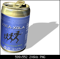
Well I decided to do this properly so thought i'd index an old book I had, you may have read it Yourself (pages 146/7)........
Can't quite put my finger on it, but somethings not right here:


 Member
Well I decided to do this properly so thought i'd index an old book I had, you may have read it Yourself (pages 146/7)........
Can't quite put my finger on it, but somethings not right here:
Member
Think its okay, did it to point between 1 and 2 o'clock but maybe needs to be between 12 and 1 to match the 'light' strip on the front of the can. Not sure.
 Super Moderator
Shadows are tricky.
Look at photos that have real shadows in them for reference.
It's often more important that an incorrect shadow is in a picture than the lack of a shadow.
And if the light is indirect and/or the surface is rough, the softer edge the shadow, the more photorealistic it is.
A lot of times, a real shadow in a photo is a shapeless blob with very indistinct edges.
-g
P.S. The cocopelli guys are "tricksters" as termed by our Sorthwestern Native Americans.
Which means yes, they could be shadows, but very weird ones!
Member
Nice work Antspants, been following your progress and it is difficult to master the mould tool but your getting there from what I've seen, well done. I will have to get some practice in myself but for now did this quick rendition
Stygg
Member
Updated version
Stygg
Super Moderator
It looks good, Stygg. You've gained some serious skills in the past few weeks.
Now, I'd like to see a logo design for a can image, not Arial, not your favorite font, but just think about an overall design, and which fonts you own that can help realize the design.
Let me fool with your concept and I'll post some info on using appropriate fonts tomorrow.
-g
Member
Ok Gary, I must admit I get stumped on what fonts to use, so look forward to some input. I was, for the want of better words, messing with the mould tool and I was amazed at just what you can achieve in the way of perspective, vanishing point, this tool must be an artists dream
Stygg
 Member
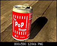
Well I haven't been participating much in this thread the last few days, so I thought I'd have a go at the pop can. I created a Pop Shoppe label, although Pop Shoppe pop never came in cans, it came in refillable glass bottles. I remember this as a kid, it came in dozens of flavours and Lime Ricky was my favourite!
[SIGPIC][/SIGPIC]
My current Xara software: Designer Pro 365 12.6
Good Morning Sunshine.ca | Good Morning Sunshine Online(a weekly humorous publication created with XDP and exported as a web document) | Angelize Online resource shop | My Video Tutorials | My DropBox |
Autocorrect: It can be your worst enema.
Member
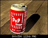
Ok this is attempt #2 I wasn't happy with the first one and after some close up inspection I realized my grid was slightly off. I also tried the stained glass/ lighten transparency trick and if you compare this one to my first one you can see the difference the transparency makes.
[SIGPIC][/SIGPIC]
My current Xara software: Designer Pro 365 12.6
Good Morning Sunshine.ca | Good Morning Sunshine Online(a weekly humorous publication created with XDP and exported as a web document) | Angelize Online resource shop | My Video Tutorials | My DropBox |
Autocorrect: It can be your worst enema.
Member
Nice one Francis, I like the design and the font, which font is that? I always end up using Arial because I'm never sure what font to use. Nice work with the mould tool as well. I've been doing a lot of practice with the under used mould tool as you can see from my last post and just finished this drawing using nothing but the mould tool, no Grid of any kind. It gives me a bit more confidence to use it.
Stygg
 Posting Permissions

 Reply With Quote


Bookmarks