Funny thing that line. In version one "Everything..." had greater prominence. Once I rearranged things, it it shrank down to 50pt on that tabloid-sized sign.
Good catch.
Take care, Mike


 Member
Funny thing that line. In version one "Everything..." had greater prominence. Once I rearranged things, it it shrank down to 50pt on that tabloid-sized sign.
Good catch.
Take care, Mike
 Moderator Posthumous
OK I got serious. So here is one with no color.
Larry a.k.a wizard509
Never give up. You will never fail, but you may find a lot of ways that don't work.
Member
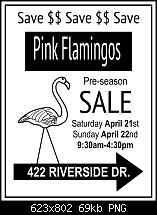
I've gone straight for the jugular, big and bold no frills, in yer face, if that does'nt catch your eye well, I'll unload all the loot from the car
Stygg
 Super Moderator
@ Larry—Silly as the sign is, you're pretty much there.
@Stygg—
The following is a general criticism, and I've marked up your design somewhat, but please do not take this as a personal criticism, okay? It's truly not. I feel from the feedback here that I need to teach some more stuff about dtp, page layout, and such. That the sign tutorial didn't hit all the points. This is me learning to teach better from everyone's input, and it's just as valuable as what members learn from the tute itself.
First, in dtp, there's something called page color. If it's too dense, it gives the reader a headache eventually, and if it's too light and spindly, it makes it difficult for you eye to follow from word to word. In both cases, the page color fails. This page color thing applies to short text outdoor signs, too. You achieve page color by 1.)choice of font (bold, condensed, serif or sans serif, and so on...see our tg Fonts & Typography forum for invaluable details on this stuff), 2.) Size of font, 3.) leading—the space between lines of text, and Xara has the feature up on the Infobar to tighten and loosen leading.
So what does page color (or density) look like in a successful and unsuccessful sign? Sorta like this:
Stygg, what I'm missing from your sign is 2% organization, 3% innovation, but other than that, you're real close.
Here's what I did to and for the sign, and I'll explain below the whys:
1.) You needed to disproportionately scale your headline and the sales point inside the arrow to make the density of the elements more artistic and fit within the overall design better. Unusually, I discourage designers from dragging on text every which way, but sans serif typefaces can withstand distortion better than a serif font such as Times New Roman. The viewer's eye doesn't immediately tell them, "Oh, the designer screwed up that typeface!" with sans serifs than it does serif fonts.
2.) I see running Pound Sterling symbols across the top as a waste of message space, and I'd say the same of $$$$$ across the top. Perhaps as an artistic border, but my original garage sale sign said "SAVE" across the top, and actual message, not just a suggestion that the even involves dollars.
My version adheres closely to the original garage sale sign, but you see what I did? I made the top of the reversed out headline into a bunch of tyre treads. And played on the fact that a Pound Sterling symbol looks a little like and "L", in the same way we Yanks use a dollar sign instead of an "s" in advertising. $ALE!
++++++++++++++++++++
This is for everyone, I'm not picking on stygg, please everyone read and understand this:
There are cardinal sins committed every day with signs, that has to do with punctuation and grammar:
• The use of several exclamation marks suggests that if the business owner shouts loudly enough, someone will buy the product. One exclamation mark is sufficient for stressing a message; often a headline is adequately emphasized with no exclamation at all. It is redundant to cast a headline in all caps followed by several exclamation marks.
• The use of quotes is for quotations, not for emphasizing a phrase. When a designer puts quotation marks around “BEST” , it creates in the reader’s mind the suggestion that the retailer is speaking euphemistically. For example, when someone writes, “Get that ‘antique’ out of my parking lot in 15 minutes,” they aren’t actually referring to your 10-year-old car as a valuable antique, but rather as a piece of junk to which they’re referring euphemistically or sarcastically. The word “BEST” in quotes will surely be interpreted by anyone with writing skills as, “They really aren’t the best deals; they mean something else.”
• An apostrophe, as far as I know, is only used on three occasions. 1.) When making a contraction out of two words, as used in Don’t run with the scissors and It’s silly to dance with an alligator. 2.) When describing the possessive state of an object, idea, or whatever, as in Gary’s post, Larry’s flamingo, and so on. 3.) When you drop a character from a word, example: Nothin’ to it! An apostrophe is not used to separate two characters, and it should not be used reflexively to separate the second-to-last character and an “s” that follows.
Don't sell yourself short and don't make yourself look less intelligent than you are in print.
Sermon for today :)
Gare
Last edited by Gare; 18 April 2012 at 03:19 PM.
Member
Cheers Gary for all that information and images. I never knew or relized, just what makes or breaks something so mundane as a poster, you sort of think throw a few lines together and it will do but not the case I am finding out. There's more to it than I thought. I must admit I don't use text or fonts very much but it seems I should brush up on these and also get some fonts you mentioned in the vid. and in your postings. I've downloaded your xar file and Jpeg images, time to get some learning done.
Stygg
Super Moderator
Posters are only mundane if they aren't designed well!
Look at all the neat blacklight posters the Fillmore West and other places had during the mid 1960s for Jefferson Airplane and Hendrix.
The message met their audience at the time, and I'm trying to encourage tg members to use Xara in a design sense. The best illustration on Earth is going to get ignored if you use a tacky frame around it, and similarly, a good idea will get lost in a poor layout.
Now, superficially, this is not a "fun" garage or boot sale, as fancy fonts are simply inappropriate for the tone of the sale. It took me years (okay, decades) to realize that fun typefaces aren't what drives commerce, and a good designer knows when to put on a "formal font" attitude, and reserve the fun design stuff for ice cream ads and vacations in the Bahamas, you know? Appropriateness is key to good design.
This is important stuff, I'm happy you're taking all my writing in with a constructive spirit implicit in the delivery, and yes, you DO use text a lot, stygg!
What did you use to respond to my post?
Fonts are just the way we dress up words. And you don't want to dress your message up and send it out without carefully crafting your idea's "wardrobe".
That audience will say, "Your sale is ugly and your mom dresses your message funny!"
Or something like that.
I'm outa here for a few days. Someone unrealistically wants a design done for money they advanced me.
-g-
Last edited by Gare; 18 April 2012 at 10:43 PM.
 Member
Ooooh I get to be a princess, I like thatI even have my own Prince William! (well he may not really be royalty but he's a prince to me!)
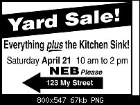
Here is a second one from me, I decided to use an old advertising principal: Less is more.
[SIGPIC][/SIGPIC]
My current Xara software: Designer Pro 365 12.6
Good Morning Sunshine.ca | Good Morning Sunshine Online(a weekly humorous publication created with XDP and exported as a web document) | Angelize Online resource shop | My Video Tutorials | My DropBox |
Autocorrect: It can be your worst enema.
Member
How much do you want for the sink PrincessOriginally Posted by angelize

I like your second less is more drawing Francis. Just finished two more so tell me what you think before Gary gets back. This poster tut. is more demanding than all the previous ones.
Stygg
Super Moderator
It's much improved, Stygg. You got yourself advertising for an event now (and make the date larger!).
I'm only popping in, and my apologies because I n eed to be elsewhere for a few days, and I'd prefer the "in for a penny, in for a pound" approach to teaching. IOW, you don't have my undivided attention, so I feel as though I'm short-changing you by simply posting "nice work."
Let me pick up our discussion on layout and design on Monday the 23rd. You feel free to discuss among yourselves, but I can't provide "quality time" in until after the weekend, cool?
-g-
Member
Well I didn't beat Gary but I will give my opinion on your work Stygg
I like the "Deals on Wheels" that's good I would stretch the words carboot sale a bit to fill a bit more of the reverse bar, and lose the reverse wheels on the right one. Remember Less is More
Like Gary said,Make the date and entry fee lines bigger, this is a sign that will be seen from a moving vehicle, Important info needs to be big so they have time to read it quickly. The Idea with this (and with any advertising), is to a) Grab the viewers attention and b) feed them the important bits first.
I didn't find this tutorial demanding, just a bit too much like real work!
[SIGPIC][/SIGPIC]
My current Xara software: Designer Pro 365 12.6
Good Morning Sunshine.ca | Good Morning Sunshine Online(a weekly humorous publication created with XDP and exported as a web document) | Angelize Online resource shop | My Video Tutorials | My DropBox |
Autocorrect: It can be your worst enema.
 Posting Permissions

 Reply With Quote

Bookmarks