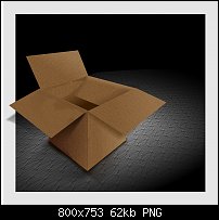
There is something, however, that disturbs me as well about the shading around the box. It looks like it is hovering over the table, not on it. Hmm?


 Member
There is something, however, that disturbs me as well about the shading around the box. It looks like it is hovering over the table, not on it. Hmm?
If someone tried to make me dig my own grave I would say No.
They're going to kill me anyway and I'd love to die the way I lived:
Avoiding Manual Labour.
Member
I could have darkened the shadows directly under the box, that would give the apperrance you refer to, but If I had done so, it would have looked just like another box with a black shadow per se, so I purpously lightened them considering where the light was coming from (earlier post) and at least it made you notice and perhaps want to reach in and plonk the box down! If so, it did its job.
Stygg
Member
Yes, you're right. Seeing how you did the shading underneath the box definitely makes me want to tie it down to stop it floating away
If someone tried to make me dig my own grave I would say No.
They're going to kill me anyway and I'd love to die the way I lived:
Avoiding Manual Labour.
 Member
Very clever Stygg! I on the other hand purposely put in the dark shadows to anchor the box, and used an out of bounds technique to draw the viewer into the image. At least that was my intent.
I've played around some more with the shading and the subtle highlights that I also added. I have also made adjustments to the shading that helps give the out of bounds area that sense of popping out of the image.
So here again is my box without the extra advert bits. Now I'm going to back to my work I have in progress and try to apply what I have practiced and learned here to a very different image.
[SIGPIC][/SIGPIC]
My current Xara software: Designer Pro 365 12.6
Good Morning Sunshine.ca | Good Morning Sunshine Online(a weekly humorous publication created with XDP and exported as a web document) | Angelize Online resource shop | My Video Tutorials | My DropBox |
Autocorrect: It can be your worst enema.
 Super Moderator
Let me jump in for a moment to offer a sort of suggestion: Frances, I took your last image and used itquite without your permissionto demonstrate a shading angle here. I believe the right flap should be casting at a steeper angle, disagree if you like, but it seems to add drama, and sometimes, incorrect "drama" is more visually interesting (but less photorealistic) than "accurate but not quite as interesting as..."
It's the artist's trade-off, you know?
Now: shall we all agree to let other membersin good faithcopy our works-in-progress to visually point out something?
You all have my permission to rip apart stuff I personally post. And just this once, hopefully Frances will forgive me, because it's totally in a constructive spirit.
Votes here? You wan to attach XAR files of your work to let others offer visual suggestions?
On a piece by piece basis?
When you explicitly permit it?
A blanket grant?
Or is this a bad idea?
If we agree, then I'd like to ask Frank to take Stygg's piece and visually provide an example of how to better "anchor" the box with shading. If Stygg agrees.
I'm tap dancing here because I want us all to respect one another WHILE helping each other in a constructive way.
g
P.S. Frances, that is a hoot the way you have one flap violating the border. Very cool, very asymmetrical.
Super Moderator
Going from the General to the Specific as an Artist’s “Process”
Hi—
I’m back with a little art lesson and art show, to better help Javier, and all of us, understand what all this “asymmetry” and “cropping” stuff is that I’m going on and on about.
Javier, you have good art instincts, and I was surprised that you chopped the back of your wonderful car illustration off, to either make it look “asymmetrical”, or because you thought you were following what I was saying to an exact and precise extent.
No. You’ve cheated your talent and cheated the audience by hiding most of your illustration. It looks like a mistake, I’m sorry, like a careless person took some scissors and messed with your artwork.
One of THE RULES OF ART is: don’t listen to Gary all the time, especially if you’re not sure you understand me. What I’m going on about with “composition”, is that what you do when you decide to create something is you think about it first. This list goes from very general to very specific, as part of your creative process…
1. You have an idea or someone gives you a job.
2. You decide how you will illustrate it and in what style. IOW, will you use Xara, will it be a photo, a painting, a song (don’t laugh!)—and then your style? Will it be a technical drawing, realistic, cartoonish, color, black and white, what emotions will you have the illustration say; serious, funny, dramatic, boring? Hey, “boring” is a valuable art style, I’m serious. Do you REALLY want lively wallpaper in your bathroom, that shouts at you when you’re in there in the middle of night? Forget “boring”; let’s call it “muted” or “relaxed”. There is a very real place in the Art World for artwork that relaxes you, and doesn’t provoke you.
3. You decide what kind of elements will be in the drawing. How many? What are their relative sizes compared to one another?
4. You decide on the dimensions and aspect ratio of the canvas. Portrait? Landscape? Square?
After step 4, a lot of this process is up to your style, level of skill, style you need, colors, composition (where objects are arranged), possibly the angle of the “camera” as your scene suggests, lighting, shading, and so on.
¤ ¤ ¤ ¤ ¤ ¤ ¤ ¤ ¤ ¤ ¤ ¤ ¤ ¤ ¤ ¤ ¤ ¤ ¤ ¤ ¤ ¤ ¤ ¤ ¤ ¤ ¤
I’m going to take you all on a ride now, as if Gary Bouton has to do a car illustration. Two things first:
1. I’m sick of car illustrations done with Xara. It’s a personal dislike and not a reflection on any talented person who wants to take on the enormous task of drawing a car in a photorealistic style. My only objection is that we’ve all been there and done that! Xara Designer has become synonymous with airbrush illustrations of cars, and we all know it’s capable of doing other things, like watches, silverware, and other “commercial illustration” things. The people who do cars have an incredible skill set that I’d be scared silly to try to challenge (if I was stupid enough, which I occasionally am). But “technique” is NOT the whole of an artist. There’s lots of great artists in history who had no technical skills. Listen to Bouton here: don’t get hung up on displays of technical excellence. Don’t dump on it, either. Technical skill is one part of art. If you don’t know how to compose a scene, all the technical excellence in the world will only produce mediocre artwork.
2. I didn’t draw the car I’m going to show you. I’m not that good, and if I were, I wouldn’t have the time. So I did a crude model of a car, then rendered it from different angles to show how “composition” makes “Art”. So ignore the hard edges along some of the curves, because I was pressed for time, okay? This is JUST AN EXAMPLE!
The first guy here, Altima 01: This is a boring posse for a car, isn’t it? Just a flat, non-perspective view of its side. But the COMPOSITION kicks butt, don’t it? Why? Because the composition is asymmetrical: I have all this space on top that’s empty, right? WRONG. The sky pushes the viewer’s eye downwards to the car. The cloud also sort of points ar the car. Clever, huh? So I used blank space on my canvas (called “negative space” or “white space” even when a color is used) in an inventive way for the good of the composition, and my car here is still the star of the composition.
Next, Altima 2: Hey, if you want to hide part of the star in a composition, the best place to hide it is BY NOT HIDING IT! If I were drawing this in Xara, I’d make a copy of my car, fill it with white with a black outline, and then use a linear transparency on it to blend it into the original color shapes below. The composition is quite definitely asymmetrical, and eye-catching, and less work than you’d imagine to draw it. Now, photorealistically, this pose is about 14 feet above the car's hood, so it's not very "natural". Think like a photographer when you bild a scene. Where would a photographer go, comfortably, with a camera? You can break the rules, but you need to understand them completely before doing so!
Altima 3: This is the most “commercial” composition, but why would anyone draw a car in the first place? Either because they’re totally in love with a certain make and model, or because it’s for a poster or advertisement. What I’ve done here is first, take my canvas and break it into interesting, unequal parts. Then I decide on “camera angles” (views) of interesting parts of the car.
I have “staged” the composition” so you have glimpses of the car, but it’s a tease because you only see parts, and then the “payoff” is at the bottom. This is visual story-telling, and it works, and the page is almost literally in motion, and you can cheat on the amount of detail on the bottom car…because it’s relatively small.
But the biggest point I want to make here is consider the composition first, not the shapes. What you draw is subordinate to the composition. And it’s a hard thing to understand at first, but hey, you got three examples here now, and you can download the XAR files and just play around rearranging the bitmaps.
My Best,
Gary
Member
I have no problem at all with that Gary, if anyone wants to alter in any way they want to, please feel free. I like what I accomplised because it did make you want to move the box and I learnt lot from this tut, however if someone makes alterations and I like, well it would be something else I've learned and extra under my belt, a bonus if you like.
Stygg
 Member
Hello people,
Thank you very much for your comments, I didn't answer sooner because I wanted to read all ones.
My answer is written in a good mood way, it doesn't try to be rude on any ways, I mention that because you know written phrases can sound on a different way that I try to express
I think this (composition subject) is harder than I thought, I believed I understood the concept but I didn't.
Gary,
I read a lot of times your comment and I'm not pretty sure of understand what is right and what's wrong, I read it over and over and over and I'm always get confused.
Trying to be clear, I find it difficult to understand if all the three are correct or just the two last.
According to car make, you're right I'm a fan of that make and the car is drew from a photo of it hehehehehe.
As I mention several days ago, I need to learn about composition ever since I aware that composition exists, several weeks ago I didn't know it, when I drew anything something bugged me and now I know what it is and it is called composition, I just need to know how to get the right one.
I really thank you for the long explanation you've sent to me, I'll try to read them some more times and then apply them over my drawing, let see what comes up.
Again thank you very much, I really need your comments to carry them out, that's the only way to improve.
Javier
Super Moderator
Hi Javier—
When you draw a picture, you often look at an object for reference, right?
But when you make a composition, a composition is abstract, it is the artistic expression of a feeling or an idea, so there is no real word reference for you to copy.
I had this composition stuff drilled into my head in college, and continued to have it drilled into my head when I was an advertising agency art director. So please let me say to everyone that I am sensitive to those who didn't spend a year, or four years, or a million years in art school learning the basics. "Basics" such as composition, are the foundation of better art. Not just that, something such as composition is what you hand other things (objects, or the less tangible "style", and "technique") on to.
Lucky for you, Javier, there are many, many good books written on composition. If you can find one in Spanish, I'd say "go for it!"
Good books on Amazon, on art composition
Let me give this one more try with something very simple. Actually, this is the same as my car examples, but much more direct without the distraction of the artwork itself, only the "composition". To answer your earlier question: I think all three of the Altima compositions are "good". The compositions are different, yet they all feature the same car. Now, below, there is only one good composition:
Which "artwork" is most interesting? Now: Why?
—Gary
Last edited by Gare; 29 January 2012 at 05:59 PM. Reason: Had to go turn off the faucet in kitchen. The dripping sound was interesting, but annoying.
 Member
Then again, composition can mean different things depending on one's entry point to art or design...
I'm not a sportaldislexicartaphobic per se. I don't avoid creative artistic expression from fear. I'm just not what I would consider an artist nor, more generally, artistic. I am certain I do not have an artistic bone in my body.
I would characterize myself as a designer: someone that assembles and lays out, composes for a specific purpose of conveying a message. I think I have a decent eye for composing others' art to convey a design. I can most often (eventually) choose appropriate typefaces to express what I believe the point to be without distraction. I'm pretty dang good at layout. Subtle and not so subtle typographical adjustments? Yeah, so far what has pleased my eye has gotten the nod from customers over the years--even if they themselves don't understand the nuances.
That said, I wholly appreciate to my core an artist's work. Perhaps even with a tinge of jealousy. Which brings me to the point: I appreciate Gary's efforts to teach art expressed through software applications and other mediums but myself am not competent enough to contribute words on the subject.
My intent is to read and read some of these messages in these threads versus perhaps books on the subject. Why? To me the forum-based subject is more personal to me.
Take care, Mike
 Posting Permissions

 Reply With Quote


Bookmarks