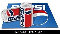
Here's my first attempt at creating a soda can. I am starting to venture out past the tutorials and creating some different objects. I would appreciate any feedback.


 Member
Here's my first attempt at creating a soda can. I am starting to venture out past the tutorials and creating some different objects. I would appreciate any feedback.
 Moderator Posthumous
Looks good Psaumure the only criticism I have at the moment is the shadow cast from the front can onto the can behind. It would be better if you could make it form to (wrap) to the shape of the can it is being cast onto. The other shadow cast from the vertical can onto the pepsi logo seems a bit to light to me. Otherwise nicely done.
Larry a.k.a wizard509
Never give up. You will never fail, but you may find a lot of ways that don't work.
 Member
Nice work. I'd pay a little attention to the wrapping of the logo around the cans. At the neck and base of the can you can clearly see how it is curved. If you compare the base curvature with the curvature of the P you'll see they don't quite match, similarly for the I and the neck. I specifically metion these because they are the easiest to compare the curvature with, but it means all the curvature is just a little out.
Really getting there though.
 Member
Looks good Psaumure. Just a littl touchup on the points already mentioned and you've nailed it.
Member
Thank you everyone, that was very helpful. I got the shadow but I'm still working on the curvature of the label. I will post again when it's completed. Thank you again for your helpful comments.
 Posting Permissions

 Reply With Quote
Bookmarks