Welcome to TalkGraphics.com
Page 3 of 5 FirstFirst 12345 LastLast
Results 21 to 30 of 43
  1. #21
    Join Date
    Jun 2009
    Location
    Reading. UK
    Posts
    6,985

    Default Re: Designer Pro 7 - Splash screen

    Similar?!
    Well, there are a million and one things that look similar.

    And this is the Pro software that is 'licenced to kill' all the others.

    Click image for larger version. 

Name:	7Pro.png 
Views:	119 
Size:	32.7 KB 
ID:	82006

    Featured Artist on Xara Xone . May 2011
    . A Shield . My First Tutorial
    . Bottle Cap . My Second Tutorial on Xara Xone

  2. #22
    Join Date
    Sep 2000
    Location
    Bracknell, UK
    Posts
    8,659

    Default Re: Designer Pro 7 - Splash screen

    Rik, all I can say is that the 7Pro combination brought the thought "gun" into my head, followed by "Bond". I'm not suggesting your design is a copy.

  3. #23
    Join Date
    Oct 2008
    Location
    Sundern, Germany
    Posts
    352

    Default Re: Designer Pro 7 - Splash screen

    I do think that the version 6 logo looked much more innovative and professional - but well, the version 7 one is still far better than, say, Photoshop's ("Ps") ;-)
    Alexander Ewering
    instinctive mediaworks

  4. #24
    Join Date
    Jun 2009
    Location
    Reading. UK
    Posts
    6,985

    Default Re: Designer Pro 7 - Splash screen

    OK.
    Finished with the 7Pro (Bond type look, as paul would put it ).

    Click image for larger version. 

Name:	splashscreen.png 
Views:	127 
Size:	74.6 KB 
ID:	82013
    Attached Images Attached Images

    Featured Artist on Xara Xone . May 2011
    . A Shield . My First Tutorial
    . Bottle Cap . My Second Tutorial on Xara Xone

  5. #25
    Join Date
    Oct 2008
    Location
    Sundern, Germany
    Posts
    352

    Default Re: Designer Pro 7 - Splash screen

    Slightly too high bling factor for my taste, and no recognizable layout (nothing is aligned. HEY, THERE'S THE NEW SNAP TOOL. NOW USE IT!! ;-))
    Alexander Ewering
    instinctive mediaworks

  6. #26
    Join Date
    Jun 2009
    Location
    Reading. UK
    Posts
    6,985

    Default Re: Designer Pro 7 - Splash screen

    Your opinion - My opinion - Who knows?

    All of the work was drawn using just the eye.
    Just having a bit of fun.

    However, a bit of thought did go in to it.

    Xara is lined up with the top left of the faint Xara in the background, which itself is more or less central.
    The bottom of Xara is more or less lined up with the bottom of the 'D' icon on the right, which is more or less equidistant in the corner.

    Designer Pro 7 is placed to look central (to my eye) rather than right at the vertical centre.
    The wording has a lot of weight on the right, so, to me it did not look good absolutely central.

    The small catchphrase (tag line) is more or less lined up with the PANTONE logo.

    I could list many 'not lined-up things' in the original.
    I wonder why they didn't use the snap tool?!


    Bling?!
    This is what you call BLING!
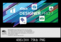
    Click image for larger version. 

Name:	xdp7orig.png 
Views:	127 
Size:	79.3 KB 
ID:	82014

    Featured Artist on Xara Xone . May 2011
    . A Shield . My First Tutorial
    . Bottle Cap . My Second Tutorial on Xara Xone

  7. #27
    Join Date
    Oct 2008
    Location
    Sundern, Germany
    Posts
    352

    Default Re: Designer Pro 7 - Splash screen

    Hehe. I guess the original is intentionally not-lined-up. But as you said, so is yours. And don't take my constant complaining too seriously ;-)

    And hell, yes, the splash I designed for DTPBlender (pretty similar to Xara before I even knew Xara ;-)) a few years ago was probably worse

    Click image for larger version. 

Name:	splashdtp.jpg 
Views:	131 
Size:	72.7 KB 
ID:	82015
    Alexander Ewering
    instinctive mediaworks

  8. #28
    Join Date
    Sep 2000
    Location
    Bracknell, UK
    Posts
    8,659

    Default Re: Designer Pro 7 - Splash screen

    I like Xaras screen. It's rather clever and fun, I think. At first glance it looks flat, but then I realised it isn't. Nice job Xara.

  9. #29
    Join Date
    Jun 2009
    Location
    Reading. UK
    Posts
    6,985

    Default Re: Designer Pro 7 - Splash screen

    Quote Originally Posted by pauland View Post
    I like Xaras screen. It's rather clever and fun, I think. At first glance it looks flat, but then I realised it isn't. Nice job Xara.
    To me, the XDP6 logo is what I call clever.
    In my opinion, one of the most clever and professional designs I have seen.

    But more than anything else, Xara is a very 'personal' product to me.
    Maybe to others also.
    It's the product that I started to use that got me up and running with drawing on a computer.
    So, when something as personal as this makes a change, then you look at it from your own point of view.
    Well, I certainly do.

    Therefore, views are certainly going to differ.

    Featured Artist on Xara Xone . May 2011
    . A Shield . My First Tutorial
    . Bottle Cap . My Second Tutorial on Xara Xone

  10. #30
    Join Date
    Aug 2001
    Location
    Birmingham, England / Javea, Espana
    Posts
    2,343

    Default Re: Designer Pro 7 - Splash screen

    Click image for larger version. 

Name:	7.jpg 
Views:	145 
Size:	87.1 KB 
ID:	82034recycling to make an alternative splash screen.
    Nothing wrong with the proper one mind you.
    Derek
    Last edited by masque; 29 May 2011 at 08:00 AM.


Bookmarks

Posting Permissions

  • You may not post new threads
  • You may not post replies
  • You may not post attachments
  • You may not edit your posts
  •