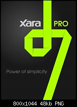
Power of simplicity!!!


 Member
Power of simplicity!!!
Sorry for my english

 Member
I like it!!!
Personally, I like the blue the best. That's just my personal opinion.
~ Madalynne ~
a.k.a.: M1SS D3V10US, a.k.a.: Sharkie
| My TalkGraphics.com Albums | Xara Xone Guest Tutorial 98 |
 Moderator Posthumous
Nice design, I like the way one letter flows into the next. All are nice but I tend to fravor the green one.
Larry a.k.a wizard509
Never give up. You will never fail, but you may find a lot of ways that don't work.
 Member
 Moderator Emeritus
Cool. I would not be surprised if Xara comes up with something very similar. After all, the Designer 6 logo was very specific to that version.
Time will tell.
Gary W. Priester
Mr. Moderator Emeritus Dude, Sir
gwpriester.com | eyetricks-3d-stereograms.com | eyeTricks on Facebook | eyeTricks on YouTube | eyeTricks on Instagram
 Posting Permissions


 Reply With Quote
Bookmarks