I'm with Keith.
Why make it hard. 3D extrude is the tool to go

 Member
I'm with Keith.
Why make it hard. 3D extrude is the tool to go
Account closed
Member
Anything that goes to print should be ideally be vector's only, especially any type of typography. It will stay sharp and crisp and the file size will be smaller when distributing or e-Mailing documents. The extrude Tool will convert any text to bitmaps.
Member
True, but it depends.
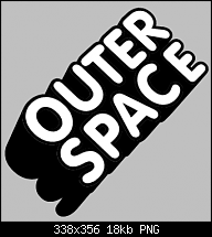
The above PNG is just 18k, perfect for email at that size and any 3D extrude in Xtreme remains editable vectors, so can easily be exported to the resolution required for print (if this it what Dave wants) at any time.
Also, any vector sent to print is rastized as it passes through the printers RIP (Raster Image Processor)
The OP example discussed in this thread is two colours. Hardly going to be a problem when it can be quickly run through Vector Magic (many pro print/sign shops are using this now) set to two colours, or quickly hand traced as Bob did.
Below is a vector magic output from the above attached PNG file which was first run through Mehdi Fine Threshold then exported at 300dpi.
 Member
Thanks for the feedback guys.
I could extrude then convert to editable shapes, but that gives me a polygonal path entirely composed of line segments.
Similarly, extruding then tracing often ends up with some unpleasantly flattened line segments and bulging curves. It's never going to be as high fidelity as the original art, even with a good tracer (i.e. not Xara's current one).
The perspective is a bit of a problem with extrusions. In this case I'm trying to replicate the style of a logo similar to the ones here: http://www.vgrfk.com/?i=2&j=6&id=14&prior=500 (see the 'lovely neighbours' logo on the second from bottom row). I can't quite seem to get the perspective right with the extrude tool.
It doesn't really matter in this example--it's just a doodle--but I do like to keep anything I draw as simple as possible, i.e. using the minimum number of points.
Regards,
Dave
 Member
In that case, I'd rotate the text and use a 200 step blend .........
Keith
~~~~~~~~~~~~~~~~~~~~~~~~~~~~~~~~~~~~~~~
There are 10 types of people in this world .... Those who understand binary, and those who don't.
 Posting Permissions


 Reply With Quote
Bookmarks