I'm working on logos for a system our enterprised developed.
This is a Customer Royalty system .
I'd like to receive your comments and advices to be able to improve them and/or choose one.
I'm uploading two diferent types.
Thank you very much


 Member
I'm working on logos for a system our enterprised developed.
This is a Customer Royalty system .
I'd like to receive your comments and advices to be able to improve them and/or choose one.
I'm uploading two diferent types.
Thank you very much
Last edited by jvila; 19 February 2009 at 04:28 PM. Reason: misspeling
Javier
 Member
For me the green logo in the middle is easily better. Much simpler and very nice artwork, too. Edit: my original response stated the green one on the right, but I did not see the one that was hidden on the right!
Saludos,
Bob.
Last edited by iamtheblues; 19 February 2009 at 04:36 PM.
** Detailed "Create A Spinning Logo Tutorial" is available in .pdf format for download at this link **
Outside of a dog, a book is a man's best friend. Inside of a dog, it's too dark to read. Groucho Marx.
Member
Thank you very much bob fro you comment.
I misspelled a phrase, the system developed is a customer loyalty sistem.
Javier
 Member
I live in North Aurora which is just north of the town of Aurora
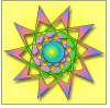
Um..I always have a hard time deciding. These are stacked in my view with the image with 4 little planets on top left, the smooth green slash on top right and the sparklier green slash on the bottom.
I prefer the smooth green slash even though the bottom one looks pretty. I prefer it because I think once it's printed it will look better.
Of the 4 planets, I like the bottom left one but I would move the orange glow to the right side of the planet where it meets the word so it kind of highlights both.
Member
Burpee,
Let me see if I understood.
I've changed the orange glow, is that the position proposed by you?.
I'm also attaching the green logo with its background ajusted in size.
I look foward to hearing from you.
Javier
Member
the planet ones are just horrible but the green one is unquestionably the best.
Illustrator doesn't control me....I control the beast within
Member
hehehehehee,
Idefriginit that's the type of messages I love to hear, I like people who tell me exactly what they think when see one of my drawings, when people have to think what likes and what not your drawing is in problems.
Thank you very much.
Javier
 Moderator Emeritus
Top right is my favorite. It is elegant!
Gary W. Priester
Mr. Moderator Emeritus Dude, Sir
gwpriester.com | eyetricks-3d-stereograms.com | eyeTricks on Facebook | eyeTricks on YouTube | eyeTricks on Instagram
Member
Gary,
you know that many times the pictures don't appear in the same order to all of us, I suppose that it depends on screen settings.
Can you point me out wich logo you like?, is it the planet one or green?.
Thank you very much
Javier
Member
Yep, that's the green slash that I like. The planet looks much better with the glow in the revised image. What's it look like with the word 'Aurora' made shorter in width?
 Posting Permissions

 Reply With Quote


Bookmarks