Ok I think I'm learning but if I'm going on the wrong track, please do tell meI came up with three versions again...


 Member
Ok I think I'm learning but if I'm going on the wrong track, please do tell me
 Member
Bottom is the best, but (and these are only personal thoughts and suggestions)
Lose the bevel on the edge, dim down the glow, and shorten the figure a bit so it resembles an "i"
Other than those, you're getting thereIt's really shaping up.
Also, use the yellow from Nexus on "knowledge" and the white from Intell on "guilds"
Last edited by geminiguy; 04 January 2008 at 01:00 AM.
Member
Font used: Informal 011 Black BT
Not a freebie though. Well wasn't to me
Looking better too - keep at it.
Personally the double swish doesn't quite sit right with me..
Also the colours chosen are a bit at odds with each other.
Play more here.
 Member
I think both timhines and sledger came up with some good designs. I definitely think 'less is more' applies here and the fewer colours, the better and the fewer elements the better too.
Paul
Member
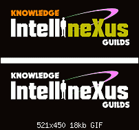
Thanks again. I have tweaked even the color this time. I removed blue and replaced it with black. Do you think this looks more elegant?

Member
Definately a step further in the right direction, it has more 'punch' now. I'm not liking the glow behind the figure much an feel uncomfortable about the swish colours (and that it seems to be coming out of his left ear).
Other than that - yes you're getting there
 Member
The best test of a logo is to create a version in just 1 color, as in a letterhead. If it still looks good, then you have a winning design.
This lastest version uses the fade behind the figurine. Print shops can have trouble creating a smooth fade (You might get banding). As long as you are prepared for jumping through even more hoops for the printer, then go ahead with that design.
As Steve said a while ago... keep it simple.
There is a standard saying in logo design called K.I.S.S.... keep it simple st----d.
Last edited by raynerj1; 04 January 2008 at 04:34 AM.
Member
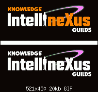
I guess now I'm going on the path of KISS again...
Member
The top image looks much better, now... just change "nexus" to the same orange as "knowledge" (this will keep more balance)
When you're done, make another copy of it using just black & white (for reasons which John mentions)
Try removing the glow behind the figure as Sledger mentioned (oops you already did) Now, instead.. try placing a "slight" glow around the radius / swish image... (but a very slight glow) this will add some depth.
You also need to be "really" sure that people who have never seen this logo, will be able to see the human figure as representing the letter i
A good way to do this, is to have others (somewhere else) view it and comment back on what the text says.... It should not be long before you know if this effect is pratical & serves it's purpose
You're picking this up really good.... just keep on truckin.
Member
Sure
 Posting Permissions

 Reply With Quote

Bookmarks