

Many Apologies for the delay in posting this, been a hectic last few days!
I was preparing a mini-tut when Gary kindly asked me if I wanted to do the fire effect for a Guest Tutorial in the June edition of XaraXone, which was a better idea as it was quite a bit to squeeze into a thread with the graphics etc. So I will be able to go into the technique in more depth then.
However I thought I would also post this explanation to give an idea of what I did.
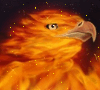
First of all thanks to Steve for posting the photo in the original thread (and thanks also to Paul for starting it). When I saw that photo I think something went click in my head, as it reminded me of folded transparent fabric. So I just played around to see if I could get a similar effect.
First of all pick your colour range, I have looked at the colours from various fire photos and a lot of the colours are what I call 'off' ie they are not all pure colours that you get in the standard colour bar. Pretty much any photo of flames will do depending on what sort of fire you wish to create, as RAMWolff stated different things burn with different colours and heat. I used 8 colours initially with a couple added afterwards when I was tweaking things. I think if there is a trick then this is close to it, getting the colours of real flames is half the battle.
Then I experimented with various plasma fills/transparencies in rectangles to see how close I could get to a 'flamey look' (see Figure 1. below).
The flames themselves were all freehand drawn with plasma fills, plasma transparencies and feathers. (I used over 100 objects, but this sounds more daunting than it is, as a lot were quite quickly and roughly drawn). I used the background rectangles as a kind of guide choosing where to add initial lighter flame shapes (and what shapes to draw), then roughly following the random flame shapes and colours as they were being layered up. I also noted from the photo the patterns (such as the arcs joining flames)and how softly diffused or hard-edged the flames were, most of which were added/defined in the later stages.
So start off drawing large-ish flame shapes in slightly lighter colours to the rectangle background, then layer them over with lighter ones and so on. I experimented with smaller feathers in the lighter colours and also long thin shapes drawn along some of the flame edges to 'harden' and define them more. Note: In general try to keep the overall flame shapes reasonably simple for this look, it's fun to see how the random patterns build up but it can be easy to over complicate the whole thing, as I found when doing another picture!
That's more or less it really, the rest was tweaking: adding a few overlaid darker flames for more contrast etc and adjusting bits. I just softened the back rectangles with a big feather, (even though this was a trial and error effort and I used the plasma filled rectangles as guides, I kept them in when finishing the final fire as they added an extra background 'glow'... a sort of by accident effect). Lastly I added a black rectangle at the very back (with a red eliptical fill to further enhance the glow effect).
I hope this gives an idea of how I did this. Although the amount of shapes used was quite large, the technique itself is fairly simple. I'm still playing around with this and hope to improve on it by the time I create the tutorial.
BTW Steve is this close to the sort of thing you thought I did?
Regards
Su
P.S. Paul - many thanks for your comments, I'm experimenting with what you said about lightening the text.
[This message was edited by Su Lawrence on April 09, 2002 at 23:58.]

 Reply With Quote


Bookmarks